Qutie Application
Research
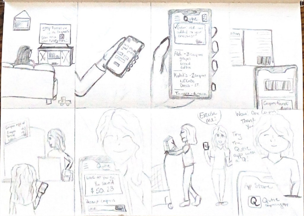
Those who have ever tried couponing know what a hassle it is. A lot of times you are handed the coupons at the store or get them in the mail, you have to separate and organize them by store, and remember them when you are trying to wrangle two and a half kids out the door. Couponing is a hobby in itself and a lot of work, so most of us just don’t bother.
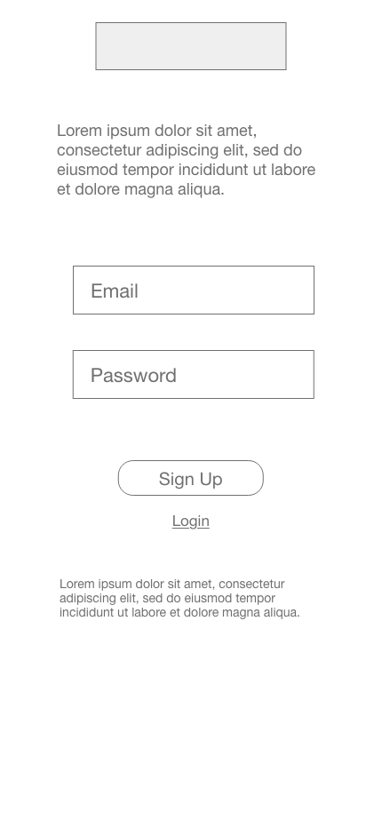
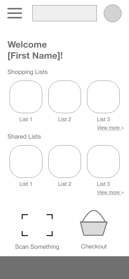
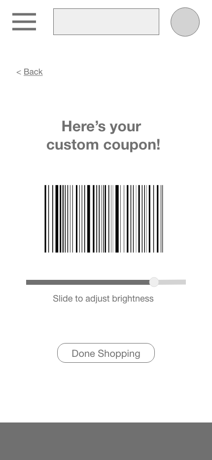
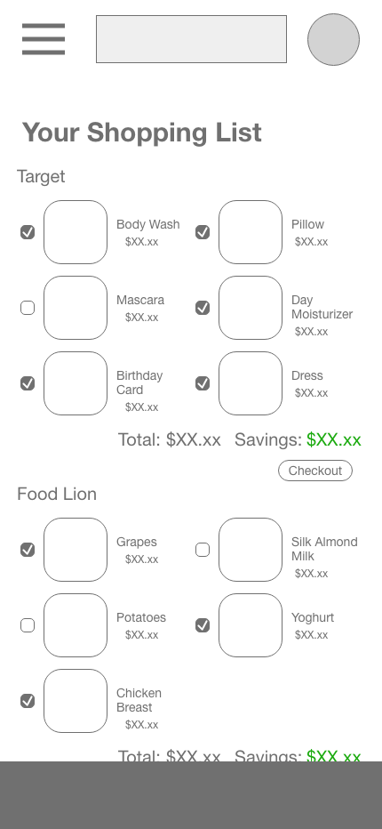
That’s where the Qutie App comes in. An app created for the every day person who wants to save money at the store, but doesn’t have time to cut coupons out of fliers or consistently forgets their coupon book at home. Not only does the Qutie app put all of your coupons in your pocket, aka your phone, it also condenses all your coupons into one. As you are checking out, instead of having to scan five individual coupons, Qutie combines them so you only have to scan once. Couponing made easy, finally!
Ideation
Here is our user persona. A young women with 3 kids who, despite doing her best to collect and use coupons, has enough on her plate and doesn’t need the hassle of normal couponing. She does her best to coupon with the time she has and try to save money at the store. She hears about Qutie from a TV ad and after downloading and using it, can’t help but share with fellow shoppers who are lugging around thick coupon books.

Conceptualize
Our primary audience are millennials, individuals who grew up alongside technology. The app should reflect their ability to understand how technology works, while still being easy to navigate and aesthetically pleasing.

Production
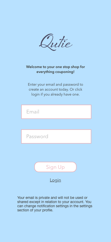
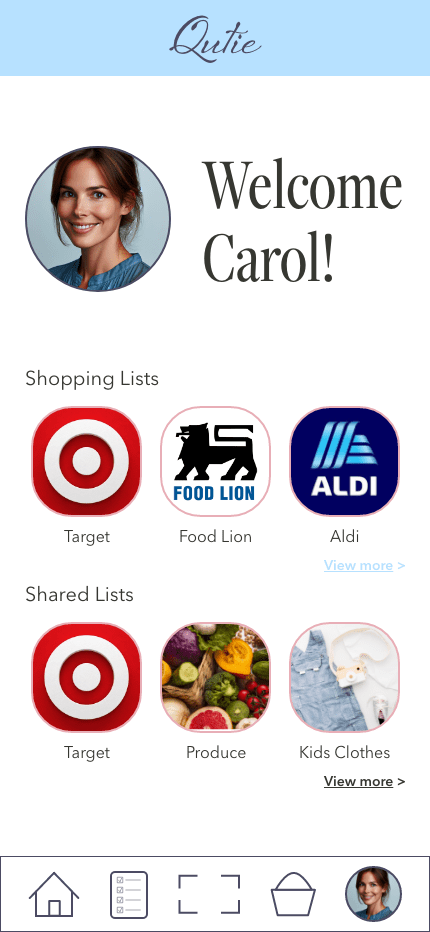
When it came to branding Qutie, I wanted it to stand out from other couponing apps, many of which have green as their primary color. I wanted to go with something softer and more calming, but still happy and uplifting. I landed on this pastel blue and wanted another pastel to partner with it, so I chose the peach. It needed something dark to anchor it, and so the navy blue. Of course, it still needed a green because it is associated with money. The fonts and logo came from similar thinking, soft, calming, but happy.

Then I just had to find the best way to apply these colors to please the eye, but not distract too much from the purpose of the app.


You must be logged in to post a comment.