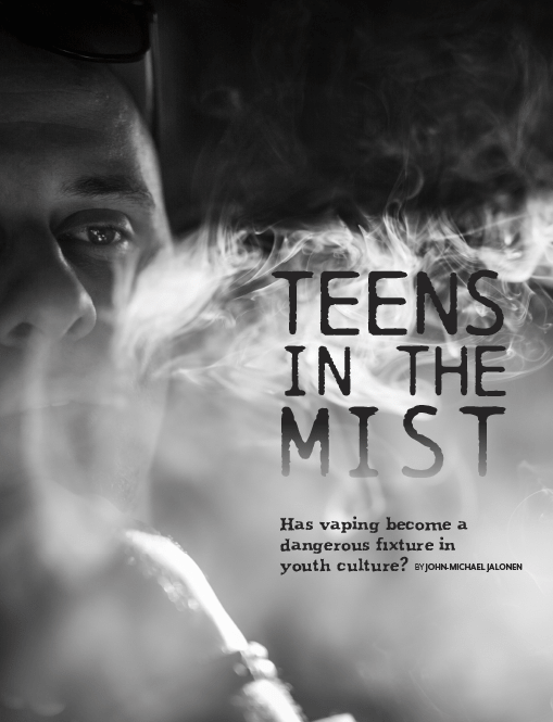
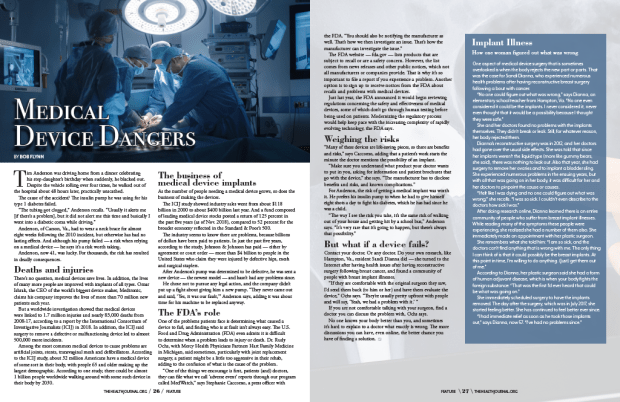
The following are pieces are from my work on The Health Journal Magazine.
The projects below were assignments from my graphic design certification class.
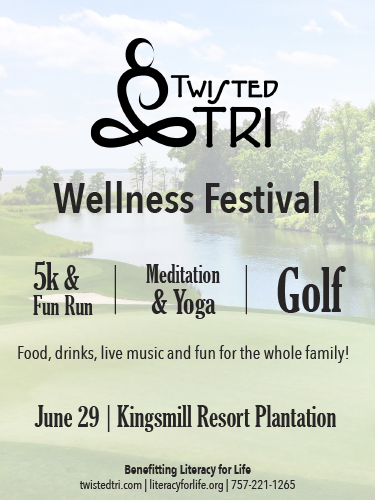
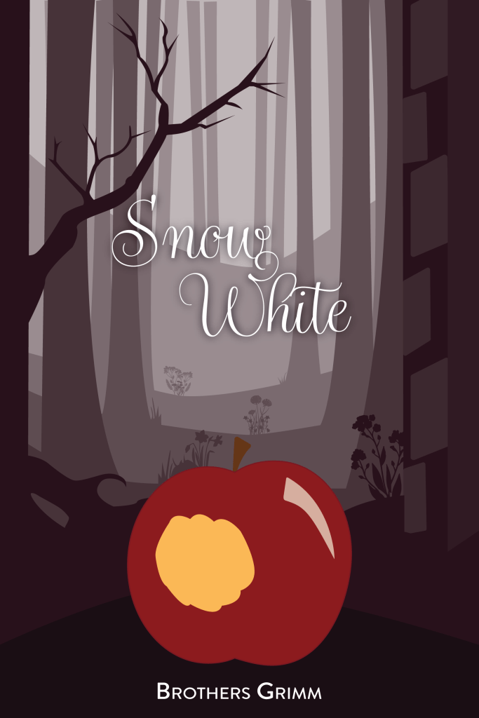
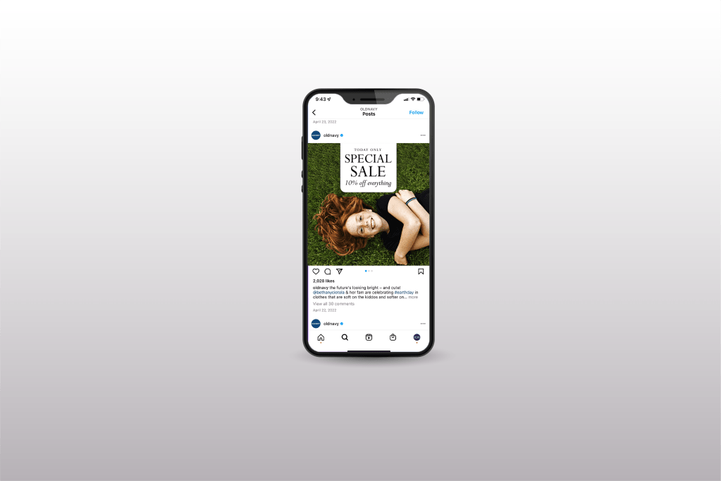
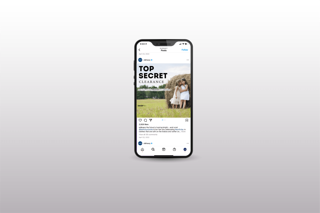
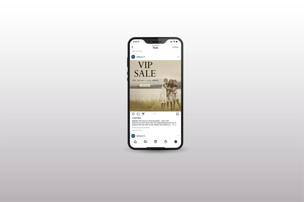
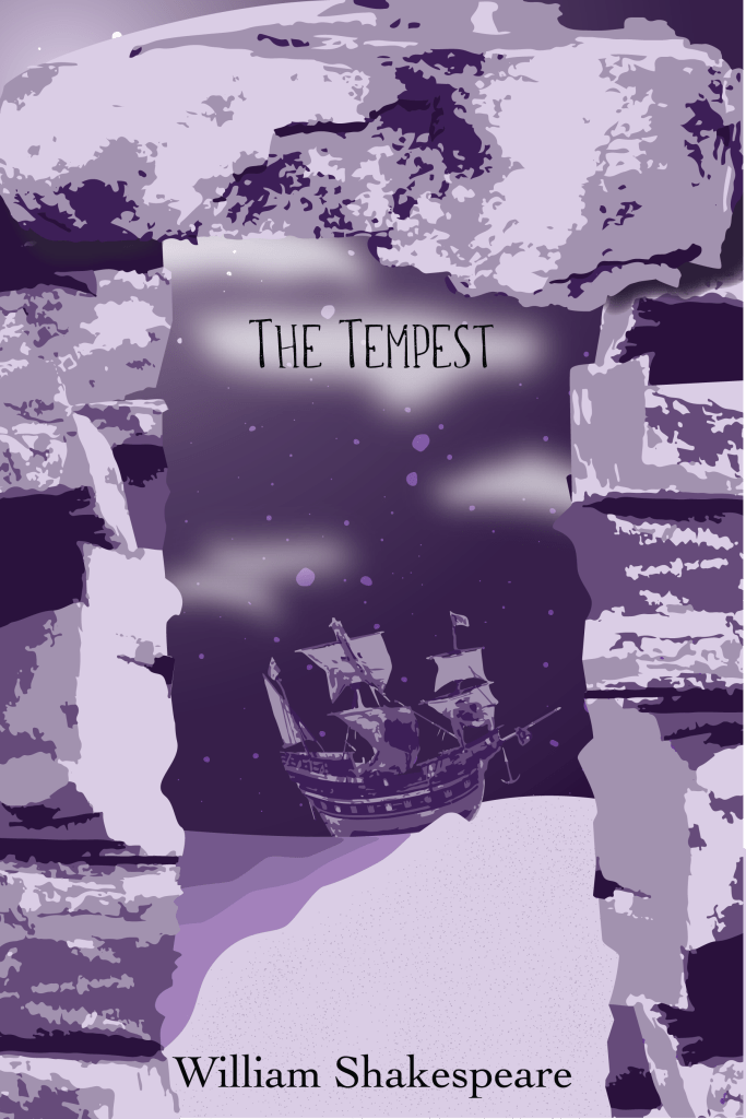
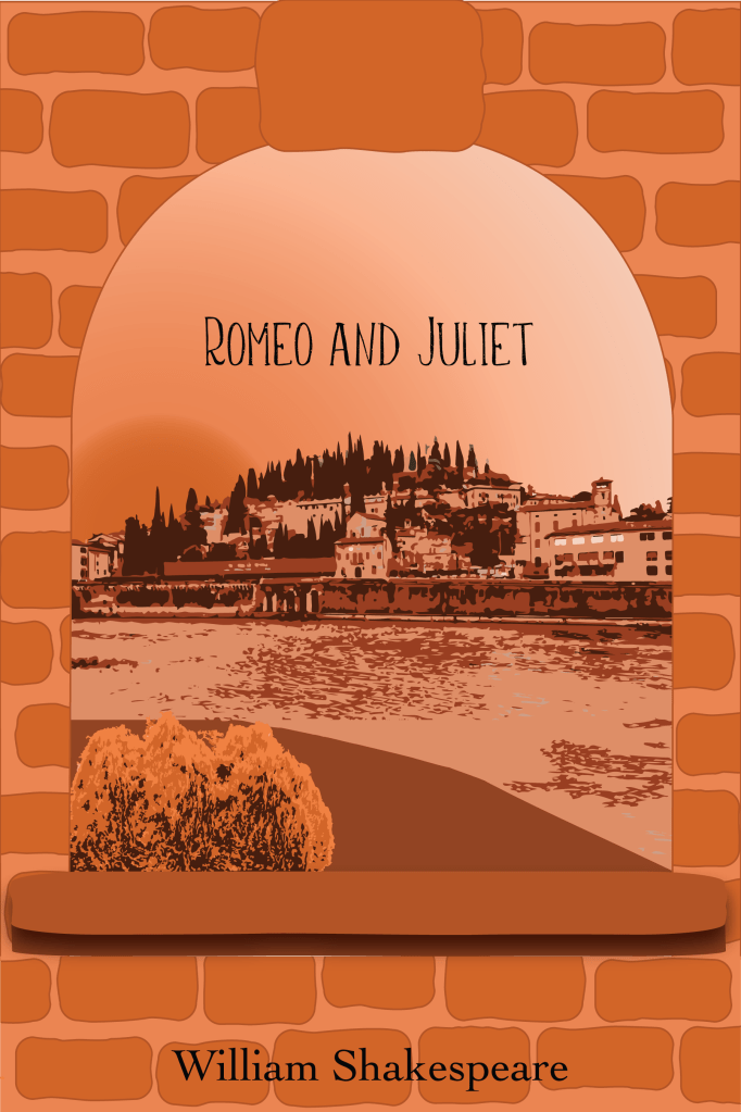
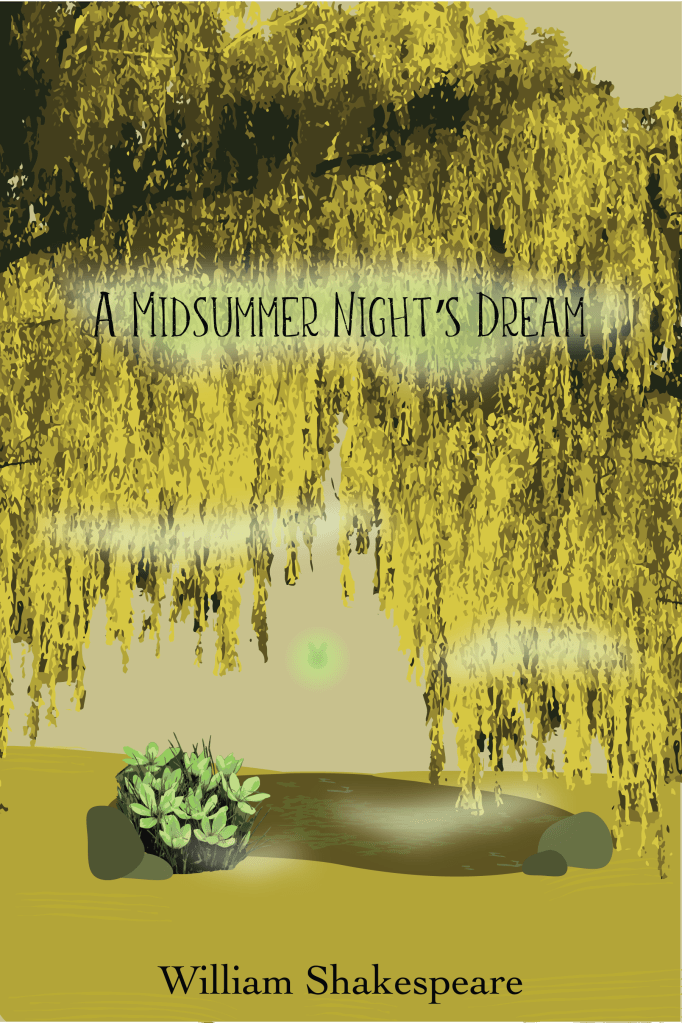
A project to recreate a book cover. The primary objectives were to use the Pen and Anchor Point Tools to create vector artwork, use at least two elements and principles to achieve unity, use an analogous color scheme, and use color to create a simulated three-dimensional space.The project was to create a typographic poster. I could only use one font family and had to use letterforms and word forms to create line, shape, form, texture, and space in the design.This project challenged me to create a cover for an album. This was one of the last projects in the course that required the use of most of the skills that had been taught so far.One project tasked us with creating social media ads that share the same visual style. The challenge was to use what had been taught so far to highlight the text while the image adds to the design, but does not compete with it.One project tasked us with creating social media ads that share the same visual style. The challenge was to use what had been taught so far to highlight the text while the image adds to the design, but does not compete with it.One project tasked us with creating social media ads that share the same visual style. The challenge was to use what had been taught so far to highlight the text while the image adds to the design, but does not compete with it.This was a project to recreate 3 book covers that are analogous to each other but each has its own monochromatic color scheme. We were also challenged to create conceptual unity between the three, in mine I had each scene framed by some sort of object. This was a project to recreate 3 book covers that are analogous to each other but each has its own monochromatic color scheme. We were also challenged to create conceptual unity between the three, in mine I had each scene framed by some sort of object. This was a project to recreate 3 book covers that are analogous to each other but each has its own monochromatic color scheme. We were also challenged to create conceptual unity between the three, in mine I had each scene framed by some sort of object.
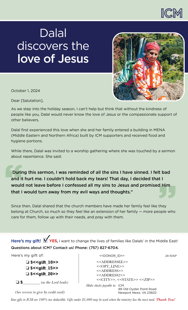
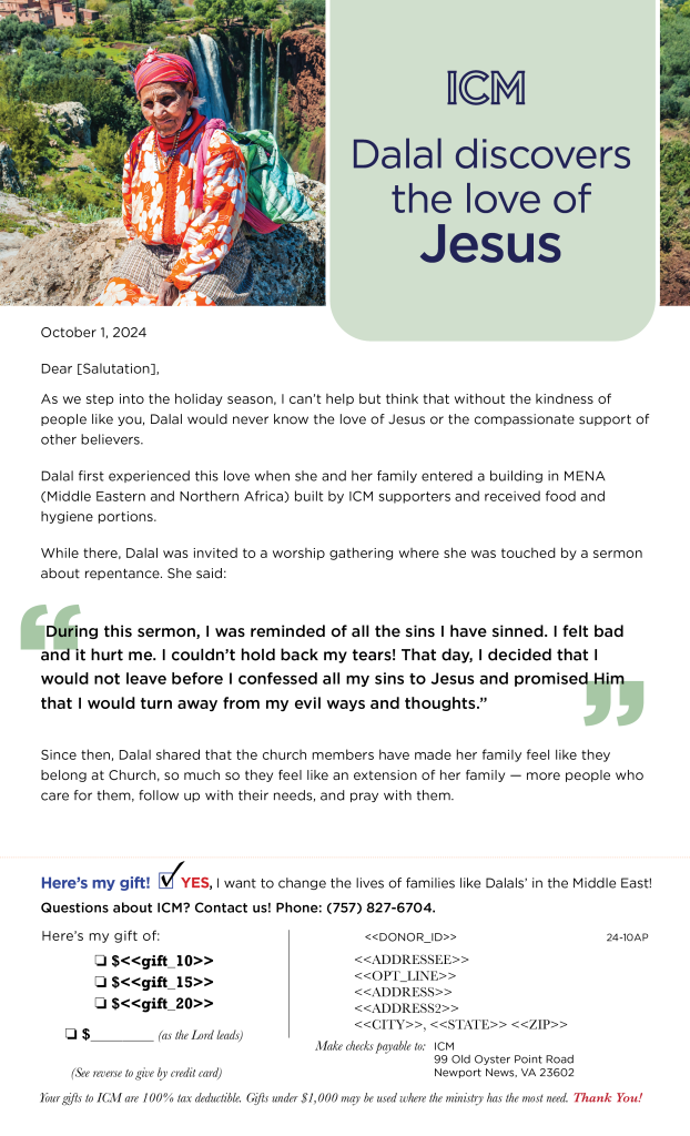
Below is work from my time at International Cooperating Ministries.


You must be logged in to post a comment.